Week 3 of Big Game Project – Finishing the bear

This week I worked on the texture of the enemy from last week.

First I tried texturing it closely to the concept art, this is what it looked like:BearTexture1

I was pretty satisfied with the result but when trying it out in the game, we realized it was actually too well camouflaged. The players had a hard time making it out against the green background of the jungle. So I played around with the colors a bit and tried to make it ”pop” a little more, adding more contrast between the spots and the rest of the fur, and making it more yellow to stick out from the vegetation.

BearTexture2But it was still not enough, so at last I pushed it even further, going from green to an almost redish brown. I also made the quills and claws lighter to make them easy to spot .

This is the final version of the bear, hope you like it.

BearTexture3


Week 2 of Big Game Project – Enemies

This week I worked on the first enemy for the game. The enemies are mostly going to be animals living in the jungle, but we didn’t want to just take normal animals from our own planet, since this game is set on a different world. So I started  to design a new kind of predator. We wanted something big and heavy so all the settlers had to group up just to bring one down, this made me think of a bear. So I looked at a few bear references and tried to change it up a bit. this was the resulting concept art:

Bear

So as you can see the bear got some leopard looking spots on the body, and quills on it’s head and neck. I also made it a little more front heavy with a huge mouth full of sharp teeth. This is not like a regular bear that eats anything, this is a real predator, stalking and hunting in the jungle.

After the concept was finished I started work on the 3D model.

BearWire

And this is how the model came out. I try to keep it kind of low-poly, to fit the games art style. I want to get a clear silhouette so it is super easy to recognize, even when you are looking at it from a top down perspective and the camera is zoomed out a bit.

Next week I will do textures and animations for the leopard-bear.

Big Game Project – The Beginning

For the last four weeks,  I have been working on a game that will be showcased at the Gotland Game Conference on the 20th of May. We are a group of six students, three programmers and three graphical artists making the game over an eight weeks course called Big Game Project.

In this post I will go into the work I did the first week.

The idea for the game was already finished before this course started, so production began right away. The game is a survival/RTS with two layers. The first layer is a flying island where your small group of settlers live, the second is the dangerous jungle below where you have to venture to find food and resources. You play on both of these at the same time.

For the first week, we did some research into what kind of graphical style we wanted to use for the game. We decided on a low poly painted look for the game as opposed to a more realistic style, since we felt it would be less time consuming and would allow us to create all the assets we wanted in the limited time we had to make them.

The first thing I did was a model of the settlers homes, using a turn-around sketch from another artist on the team. After the model was finished I added the textures, some of which I made and some were made by the other artists.

This is the model, with and without texturing:

HouseTextureHouseWire


I also started working on the turn-around sketches fore more of the buildings in the game. These were mostly really quick sketches to get a feel of what the general design and architecture of the settlers culture was.


Game Production: Feature 6

This week I have been working on the end screen, it is the screen you get when you lose the game, and since this is a “no victory” game, you will see this screen a lot. Therefore I really wanted it to look nice. In the end of this game you will lose your “Life tree” so I wanted that to be represented in the Image, It is shown in the middle as a stump. It has a shaft of light shining on it as opposed to light coming from inside the tree, as it is shown in the game. This is to draw the viewers attention to it and also show that it no longer has any life of its own. The rest of the image is dark and gloomy with little saturation to give the viewer a feeling of despair. Only the flames of the fires burn bright, producing a thick smoke that covers the sky and sets the mood.

In the middle of the foreground we see the axe of the character in the menu screen stuck in a tree stump as a sign of the loggers victory over the forest. I think this helps the player connect the end screen to the game play in one more way.

The text is the same font as the menu screens but this time it’s a pale dark red. This is to add to the mood of the image but also as a contrast to the stark greens in the other menus. Red is also the color theme of the enemies, their hoods and hats and pants being red.

This is how it looks right now, still a few details to add.

End Screen

I created the image using photoshop as usual. Starting with a background gradient from green to blue, I added hills, tree stumps, fire, smoke and finally the Text.

This is my way of drawing fire in photoshop: I use several layers, first a layer where I draw the flames with a rough brush, nothing fancy, just to get the shapes down. Then I use the smudge tool to draw out the flames upwards making them a bit blurred. Next step is using the Liquify filter, this can create some really cool shapes that look a lot more realistic. After I have my shapes down I copy the layer and use a blur effect on the copy, then I repeat this with the blurred layer once or twice adding more blur to each layer. This gives the fire it’s glow. I then merge the blurred layers and put them behind the one still containing the nice shapes of the fire. Sometimes I play around with the colours of these two layers to get a nice feel to the fire, maybe adding some more yellow to the bottom of the fire, where it burns the hottest, and more red hues to the top. Finally adding some sparks or flakes of ash flying up from the fire gives it that extra detail.

Hope you like it!

Game Production: Feature 5

This week we have been scrambling to get all our artwork done for the beta presentation this friday. So I have been working on a lot of different stuff, mostly animations and effects.

So in this blog I’ll describe a few different animation and how I created them.

First is the enemy with the big axe, I made walk animations and an attack animation for him. These are the results:

EnemyBigWalkFrontEnemyBigAttack2

He is supposed to hit all trees in his vicinity so a spinning attack felt like the best option.

The hard part about this animation was getting the timing and build up right before the swing. It could use a little more tweaking to be perfect, but I think that in the end it was a decent animation.

The next thing I worked on was the death animation for the player character, the Warden.

For this animation I took inspiration from the other artwork I did for this character. Using the same kind of green energy or magic that the attack was made of, I imagined the Warden being made of this kind of energy and when she dies she is dissolved into pure energy which is then transported back into the heart tree where she is respawned.

This is how it came out:Warden-Death2

Making good looking fire effects was a fun challenge, it was my first time trying to animate fire and it proved to be quite tricky. First off, trying to make the fire behave realistically I had to try a few times to find the right motion. Then animate flames that leave the fire to fly upwards and fade out and lastly make it all look good repeating, with the first and last frame fitting together.

This is what I ended up with:

fire1

I’m not very happy with it, but it’ll have to do for now, I might return and improve it for the final version.

These animations were all done in photoshop using the frame by frame animation tool. This means that every frame is drawn on a different layer and put in a frame. By toggling the different layers visibility the different frames are shown, creating an animation. This method takes a lot of time, but I think I have increased my animation speed a lot since I began with this project. Both by learning new ways to streamline my process and just by getting used to the programme.

This week has been kind of stressful but also a lot of fun, animation is something I think can be really rewarding when you get to see your art come to life in the game.

Game Production: Feature 4

This week I am working on some different things, but the feature I will be talking about in this blog post is the menu screen. It is a background painting that I have put a lot more hours in than I had initially planned, but I think it’s important that the artwork is good enough to give the player a nice first impression. It also serves as a way to set the theme for the game and introduce the main character. And in just this one picture you have kind of the whole scenario of why you fight.

The image is depicting the main character on the left side, leaping forward and using her magic attack, and on the right side an enemy ready to swing his axe. Behind the enemy there is flames and a slight desaturation of the otherwise green leafy background. This shows the enemy’s intentions and goal of burning the forest. Behind the main character, there are branches to show her coming from inside the forest.

In between these two characters is the menu, with the title on top. The menu will look like it’s made of wood, like the HUD elements I wrote about last week, with green letters that have an organic look to them.

The way I make my images is firstly a sketch layer, marking out where I want my characters and other elements of the picture. Next is the background, I pick a colour that will set the mood and base for the drawing. in this case I made a dark green background with a highlight in the middle. Then I put some textures on the background with different texture brushes, in this case leafs. Then I start with the the characters, first laying down the base colours, with highlights and shadows, at this stage it looks very rough. then I start to blend the colors and add details. At the same time blending in some more light sources like the fire or the green magic light. This is followed by more layers of details and some effects, fire and magic again getting a rework to make them look more realistic, this is done with several layers and blending modes. When I am satisfied with the characters and effects I start working with the menu parts, using the same method of base, highlights and shadows, and then I will add some extra light sources to make it feel like it is in the same environment as the rest of the picture.

And lastly I will merge all the layers and do some last touches and colour correction to get the whole picture coherent, and the mood just right.
This is my work so far [Still a work in progress, to be finished this weekend] :

Meny

Game Production: Feature 3

This week I have been working on the HUD (Heads Up Display), polishing what I already had done previous weeks, and creating some new elements.

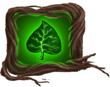
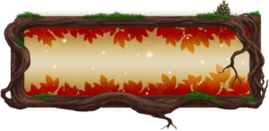
The first element I worked on was the health-bar for the player character. I wanted the HUD to feel integrated with the theme of the game. The theme being the forest, I decided on branches or roots for the health-bar outline. This was my first iteration:

Healthbar1

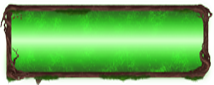
But after testing this with the temporary background colour and size, I realized that the outline was too thin and would not be clearly visible in the game. I wanted the health-bar to be green for easy recognition, and to fit with the forest, but I after playing around and looking at it I was not satisfied with this neon green bar. One; it didn’t look organic, and two; it was not clear what it was representing in the game. My solution to this was to change the colour to a very similar to that of the skin of the character, and adding some leafs to make it more in line with the theme.

This is the second iteration:

Healthbar2

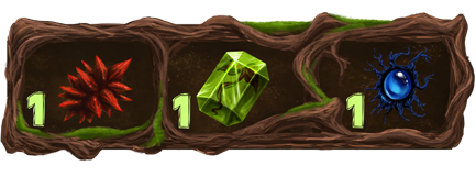
The next thing I did was a indicator for the power-ups. At first I designed it to be similar to the health-bar, a square of branches with a symbol of the power-up inside. This is what that looked like:

Powerup1

But after talking with the game designer and the programmers, I realized that you would be able to have multiple power-ups activated at the same time, so this solution would not work.

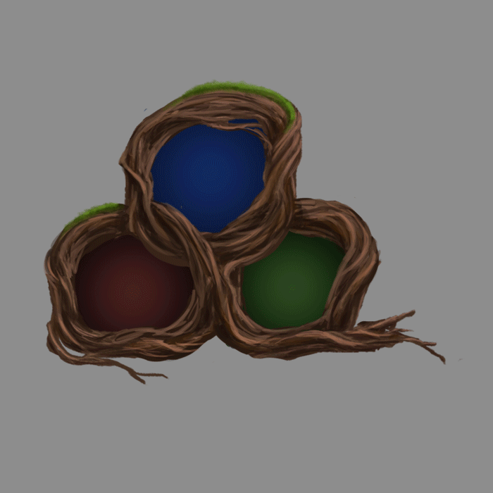
To compose all three power-ups in one HUD element I went with three rings of branches nestled together. Filling each one with a color and an icon for the specific power-up, also adding a glow effect to make it really clear what was active and what was not.

After some more talk with the designer, we decided on a 10 second timer for all power-ups, and I created an animation of the timer.

This is the final result for the power-up HUD (animation set to double speed):

Powerup-example

Next part was the seed counter and seed graphics. This was originally done by another group member, Markus. I iterated on his designs, and tweaked them to look like the HUD I had created. For the seeds Markus had done a lot of concepts, out of which I picked my three favorites and changed some elements but kept a lot of his original design.

First Draft:

Seedcounter1

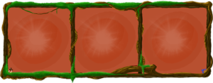
This is the finished seed counter with seeds inside:

Seedcounter2

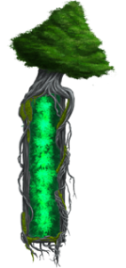
And lastly this week, I polished the design of the heart tree health-bar. This has been an ongoing process from last week, also based on Markus original design:

Hearttreebar

So over all, a lot of things has gone from sketch to almost finished this week, and it feels good to have a few more things done. I personally think the game is going to look awesome and look forward to see my HUD implemented in the game next week.
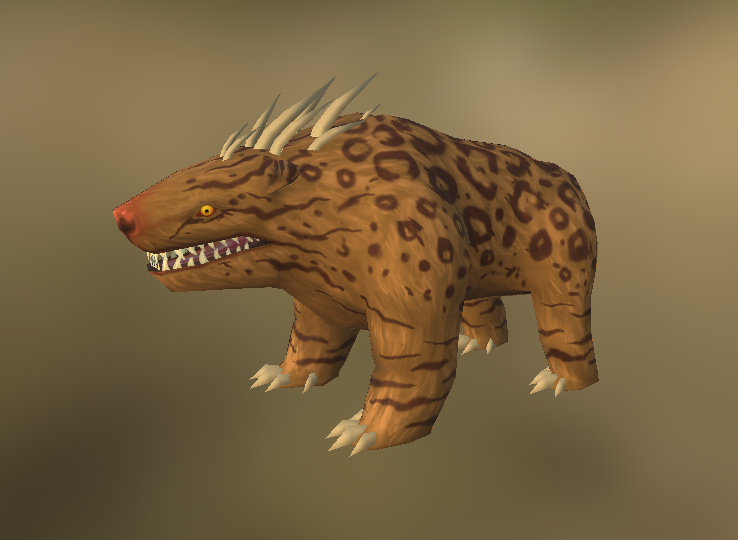
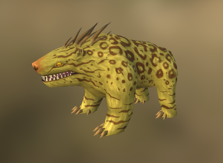
Game Production: Feature 2

This week I have been working on our main characters animations. Beginning with the walk cycles and attack specifically. It has been going pretty good, animation is something that I feel I know how to do since I have studied animation before. The hardest part was to make them look good on such a small model. But after some experimentation and trial and error I came up with a technique that I liked and looked good enough for this project.

Production started with taking the image I created earlier, scaling it down to a size that will be used in game, in this case 64 x 64 pixels. Then I used photoshop’s inbuilt animation tool and started making the animation. I work frame by frame on different layers, starting with the key frames and then filling in the frames between. The first view I did was from the front. Since this was the first one, it defined how the walk would look, therefore it took a little longer than the other angles as I was trying out different walk styles. After that i did the side views, the second one being a reflected version of the first with some changes because the character is not symmetric. And lastly I did the back view, this was an altered version of the front view, the trickiest part here was the tail, and making it sway in a nice way. I used few frames in this animation because it is going to be very small and does not need to look perfectly smooth, but if there is time by the end of the project, more frames could be added.

Warden_walk1

The attack animation was a lot of fun to experiment with. I was thinking about what kind of attack the warden should do, and decided on a magical green energy attack, matching her glowing green eyes. The animation is of her lifting her arms and clapping her hands together creating a magic burst. This surge of energy is also shown in her eyes as they light up, and her hair, as it rises as if from static electricity.

Warden-Attack

When I was done I used the Sprite Sheet Packer programme and made spritesheets of all the different animations which have now been implemented into the game.

Over all, this weeks work has gone smoothly and I am happy with my results. Next animation will be the death and respawn animations for the warden.

Game Production: Feature 1

This semester we are creating games based on the concepts created last year. Choosing between the concepts of the other groups, we decided on one called Green Warden, a tower-defense game set in a forest.

The first asset I started working on was the players character. This character is a spirit of the forest who is trying to save the ”Life Tree” (the heart of the forest and her home) from human loggers and foresters. She does this both by attacking the enemies herself and by planting trees that come alive and attack the enemies.

The setting for this game is a Nordic forest, with characters influenced by Nordic mythology.

The spirit or “Warden” is influenced by the Swedish mythological creature “Skogsrået”, a female embodiment of the forest who lures men deep into her realm, using her beauty, to devour them.

With this already established creature in mind, I started to look for references. One depiction I really like is this:

1024px-John_Bauer_-_Princess_Tuvstarr_gazing_down_into_the_dark_waters_of_the_forest_tarn._-_Google_Art_Project

By John Bauer.

I started out doing a concept sketch, trying to incorporate the different elements of my idea. After the initial sketch I worked on finding the right angle for the character in the game engine. When I was satisfied with the angle and had the proportions right I did a first draft of the characters sprite (actual in-game image). First with lineart and then adding colour and shading . This was the initial sketch and design:

Warden3Warden1
After trying it out on a background I felt that the color of the character blended too much with the environment. I changed the hair and skin colour too look more like a pale, almost glowing young woman with long blonde hair, more like the reference I looked at earlier.

Since the character is in a situation in our game where she can not use her charm to lure the attackers, I wanted her to be in a rage, a battle mode. I gave her horns to make the silhouette a little more sharp, giving her a more aggressive look, and glowing green eyes to show her inner power bursting out.

She is partially covered in vines and leaves to show that she is one with the forest. She also sports a slender tail, making it very clear she is not human.

This is the result which I am much more happy with:

Warden2

Now I am working on drawing the sprite from different angles, adding side and back views.

Concept Assignment Continues

Work on the concept moves forward. Third week we made a paper prototype of the game, a physical representation of how the game is supposed to work. We got a lot of good feedback, and needed to iron out some stuff that were unclear about the game design, such as level design, puzzle difficulties and game scope.

Last week we worked on our pitch for the game, we then had a test pitch in front of two teachers. The test pitch didn’t go as well as I had hoped, but we got a lot of feedback and tips on how to improve.

This week is the last of the project. We will work on completing the design document for Friday and polish the pitch for Wednesday.